
|
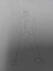
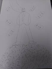
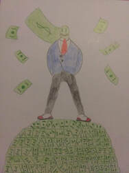
Title: Business Man
Size: 11in x 14in Medium: Illustration Completion: March 2019 |

|
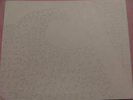
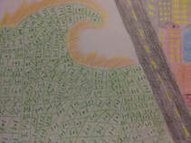
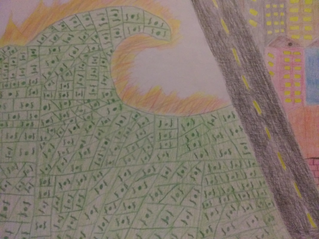
Title: Wave of Wealth
Size: 14in x 11in Medium: Illustration Completion: March 2019 |
|
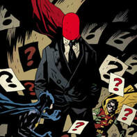
Exhibition text: Business man was inspired and influenced from Batman #700 by Mike Magnola. This illustration really contributed to my idea of having someone powerful as the center piece. This gave me the feeling of power which I than incorporated in my piece with the business man standing on top of a pile of money. Business man is meant to showcase power and wealth. The materials used to make this piece had already been made.
|
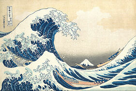
Exhibition text: Wave of Wealth was inspired and influenced from The Great Wave of Kanagawa by Katsushika Hokusai. This artwork really contributed to my idea of having a giant wave of money on fire engulf the city. When I see huge wave like The Great Wave of Kanagawa, I think of destruction and that is what money can do or cause for some people. Wave of Wealth is meant to showcase the destruction that money can cause. The materials used to make this piece had already been made.
|
Research
Artistic Inspirations
Artistic Inspirations
Illustrations. (n.d.). Retrieved from https://www.artofmikemignola.com/art-category/illustrations
|
Shovova. (2018, October 08). Everything You Need to Know About Hokusai, the Painter of 'The Great Wave'. Retrieved from https://mymodernmet.com/katsushika-hokusai-the-great-wave/
|
Mike Mignola
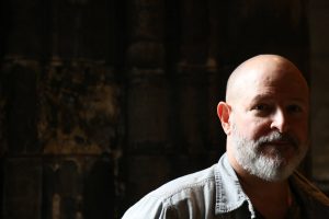
Reading DRACULA at ago 12 introduced Mike Mignola to Folklore and Victorian Supernatural Literature from which he has still never recovered. He began working as a comic book artist in 1982, working for both Marvel and DC Comics before creating HELLBOY, published by Dark Horse Comics in 1994. What began as a single comic book series would eventually expand to a “Hellboy Universe” of related graphic novels, prose novels, short story anthologies and both animated and live action films. He also wrote and drew THE AMAZING SCREW-ON HEAD AND OTHER CURIOUS OBJECTS. He has co-written novels with Christopher Golden (Baltimore, or, The Steadfast Tin Soldier and the Vampire) and Thomas Sniegoski (Grim Death and Bill The Electrocuted Criminal), worked with Francis Ford Coppola on BRAM STOKER’S DRACULA, was a production designer on Disney’s ATLANTIS: THE LOST EMPIRE, and visual consultant to Guillermo Del Toro on BLADE II, HELLBOY and HELLBOY II: THE GOLDEN ARMY. I plan to use his way of line and color to really bring out the man in the middle of my piece. I also plan on using his sense of balance with the man being in the middle of the illustration board to give him and the message a more powerful meaning. I really also like his cartoon affect in his work and plan to use that as well.
Katsushika Hokusai
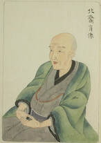
After a year, Hokusai's name changed for the first time, when he was dubbed Shunrō by his master. It was under this name that he published his first prints, a series of pictures of Kabuki actors published in 1779. During the decade he worked in Shunshō's studio, Hokusai was married to his first wife, about whom very little is known except that she died in the early 1790s. He would marry again in 1797, although this second wife also died after a short time. He fathered two sons and three daughters with these two wives, and his youngest daughter Oyei eventually became an artist like her father. Upon the death of Shunshō in 1793, Hokusai began exploring other styles of art, including European styles he was exposed to through French and Dutch copper engravings he was able to acquire. He was soon expelled from the Katsukawa school by Shunkō, the chief disciple of Shunshō, possibly due to studies at the rival Kanō school. This event was, in his own words, inspirational: "What really motivated the development of my artistic style was the embarrassment I suffered at Shunkō's hands." During a Tokyo festival in 1804, he created a portrait of the Buddhist priest Daruma said to be 600 feet (180 m) long using a broom and buckets full of ink. Another story places him in the court of the Shogun Iyenari, invited there to compete with another artist who practiced more traditional brush stroke painting. Hokusai's painting, created in front of the Shogun, consisted of painting a blue curve on paper, then chasing a chicken across it whose feet had been dipped in red paint. He described the painting to the Shogun as a landscape showing the Tatsuta River with red maple leaves floating in it, winning the competition. Hokusai had a long career, but he produced most of his important work after age 60. His most popular work is the ukiyo-e series Thirty-six Views of Mount Fuji, which was created between 1826 and 1833. It actually consists of 46 prints. In addition, he is responsible for the 1834 One Hundred Views of Mount Fuji, a work which "is generally considered the masterpiece among his landscape picture books." His ukiyo-e transformed the art form from a style of portraiture focused on the courtesans and actors popular during the Edo Period in Japan's cities into a much broader style of art that focused on landscapes, plants, and animals. From this information, I want to use the wave to represent power and destruction. By turning the wave into money instead of water and lighting it on fire help me convey that message of power but how it could be used in a negative way. I want to use Hokusai's sense of movement and texture to really bring out the wave and make it look realistic.
Reading DRACULA at ago 12 introduced Mike Mignola to Folklore and Victorian Supernatural Literature from which he has still never recovered. He began working as a comic book artist in 1982, working for both Marvel and DC Comics before creating HELLBOY, published by Dark Horse Comics in 1994. What began as a single comic book series would eventually expand to a “Hellboy Universe” of related graphic novels, prose novels, short story anthologies and both animated and live action films. He also wrote and drew THE AMAZING SCREW-ON HEAD AND OTHER CURIOUS OBJECTS. He has co-written novels with Christopher Golden (Baltimore, or, The Steadfast Tin Soldier and the Vampire) and Thomas Sniegoski (Grim Death and Bill The Electrocuted Criminal), worked with Francis Ford Coppola on BRAM STOKER’S DRACULA, was a production designer on Disney’s ATLANTIS: THE LOST EMPIRE, and visual consultant to Guillermo Del Toro on BLADE II, HELLBOY and HELLBOY II: THE GOLDEN ARMY. I plan to use his way of line and color to really bring out the man in the middle of my piece. I also plan on using his sense of balance with the man being in the middle of the illustration board to give him and the message a more powerful meaning. I really also like his cartoon affect in his work and plan to use that as well.
Katsushika Hokusai
After a year, Hokusai's name changed for the first time, when he was dubbed Shunrō by his master. It was under this name that he published his first prints, a series of pictures of Kabuki actors published in 1779. During the decade he worked in Shunshō's studio, Hokusai was married to his first wife, about whom very little is known except that she died in the early 1790s. He would marry again in 1797, although this second wife also died after a short time. He fathered two sons and three daughters with these two wives, and his youngest daughter Oyei eventually became an artist like her father. Upon the death of Shunshō in 1793, Hokusai began exploring other styles of art, including European styles he was exposed to through French and Dutch copper engravings he was able to acquire. He was soon expelled from the Katsukawa school by Shunkō, the chief disciple of Shunshō, possibly due to studies at the rival Kanō school. This event was, in his own words, inspirational: "What really motivated the development of my artistic style was the embarrassment I suffered at Shunkō's hands." During a Tokyo festival in 1804, he created a portrait of the Buddhist priest Daruma said to be 600 feet (180 m) long using a broom and buckets full of ink. Another story places him in the court of the Shogun Iyenari, invited there to compete with another artist who practiced more traditional brush stroke painting. Hokusai's painting, created in front of the Shogun, consisted of painting a blue curve on paper, then chasing a chicken across it whose feet had been dipped in red paint. He described the painting to the Shogun as a landscape showing the Tatsuta River with red maple leaves floating in it, winning the competition. Hokusai had a long career, but he produced most of his important work after age 60. His most popular work is the ukiyo-e series Thirty-six Views of Mount Fuji, which was created between 1826 and 1833. It actually consists of 46 prints. In addition, he is responsible for the 1834 One Hundred Views of Mount Fuji, a work which "is generally considered the masterpiece among his landscape picture books." His ukiyo-e transformed the art form from a style of portraiture focused on the courtesans and actors popular during the Edo Period in Japan's cities into a much broader style of art that focused on landscapes, plants, and animals. From this information, I want to use the wave to represent power and destruction. By turning the wave into money instead of water and lighting it on fire help me convey that message of power but how it could be used in a negative way. I want to use Hokusai's sense of movement and texture to really bring out the wave and make it look realistic.
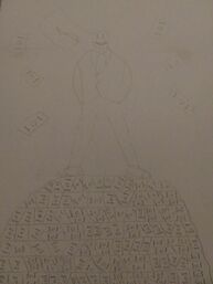
Planning Sketches
|
|
|
Experimentation
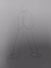
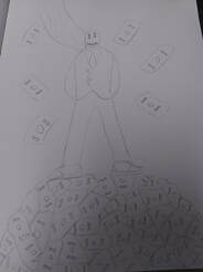
These are the planning sketches to the two final pieces that I came up with. The top three go to the business man piece and it shoes my process of drawing the man and then finally adding the money that he is standing on top of. I wanted to draw the man like the man in my inspiration because to me that man gave a powerful vibe which is what I was going for. I messed around with him and came up with the idea to add the cape and expensive shoes. To the final piece, I added a money symbol to the cape instead of leaving it blank. I then drew the money pile underneath him with money falling onto the pile. The money falling on the pile is based off of the card in the background of the inspiration. The pile of money is supposed to represent wealth and power.
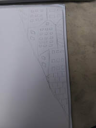
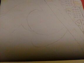
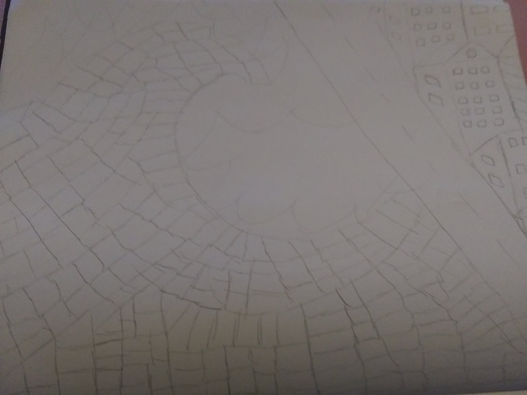
The bottom three go to the wave of wealth piece. I wanted the wave of money that was on fire to be attacking the city to show the power that money can hold. I drew the buildings on the side to represent the city that the wave was going towards. I then drew a road to separate the town from the wave also. I then drew an outline of the wave to get an idea of how the wave would look. Then I drew a bunch of money within the wave to see how it would look as well as drawing fire on top of the wave. In the final piece. I added more fire around the wave of money and I also changed a couple of the designs for the buildings.
These are the planning sketches to the two final pieces that I came up with. The top three go to the business man piece and it shoes my process of drawing the man and then finally adding the money that he is standing on top of. I wanted to draw the man like the man in my inspiration because to me that man gave a powerful vibe which is what I was going for. I messed around with him and came up with the idea to add the cape and expensive shoes. To the final piece, I added a money symbol to the cape instead of leaving it blank. I then drew the money pile underneath him with money falling onto the pile. The money falling on the pile is based off of the card in the background of the inspiration. The pile of money is supposed to represent wealth and power.
The bottom three go to the wave of wealth piece. I wanted the wave of money that was on fire to be attacking the city to show the power that money can hold. I drew the buildings on the side to represent the city that the wave was going towards. I then drew a road to separate the town from the wave also. I then drew an outline of the wave to get an idea of how the wave would look. Then I drew a bunch of money within the wave to see how it would look as well as drawing fire on top of the wave. In the final piece. I added more fire around the wave of money and I also changed a couple of the designs for the buildings.
Process
|
The first thing that I did was that I drew my positive sketch into my sketch book. I wanted the theme of the illustration to be power and wealth and the first one I drew was positive. I drew a sketch of a man with lots of money and power on top of a power of money to convey this message across.
Then I drew the negative sketch in my sketch book. I had to keep the theme of money and power so I decided to make a wave of money but it is on fire. Then I decided to have it going toward a city. This was meant to show the power of money and how if used badly can cause a lot of destruction. |
|
After I drew my sketches, I grabbed two poster boards to draw my final pieces on. I would then have to use crayola colored pencils to color in the pieces I would draw on these poster boards.
|
|
I drew my positive piece on one of the poster board first and I only changed a few things from my planning sketches. I added a money sign to the cape instead of leaving it blank as well as adding more moeny to the pile. The money took a long time to draw because I didn't want them to be to big and I wanted it to be different shapes for it to look more realistic.
|
|
Then I drew my negative piece on the poster board next. I ended up changing some of the designs on the houses as well as adding more money to the wave. Again the money took a really long time to draw because I wanted it to look realistic and the wave was really big. I also added more fire to the wave by adding it around the front of it.
|
|
This is the final piece of the positive illustration. I liked how it turned out because I feel that it really got the message across that I wanted it to.
This is the final piece of the negative illustration. I liked how the fire money wave turned out and again I really think that it did a good job of getting the message I wanted it to across. |
Reflection
Critique
In the end I am happy with how both pieces turned out. I really feel that both pieces got across the messages that I wanted them to. I also feel that they both achieved the positive and negative feel that they were supposed to. I think my inspiration really helped me gain an idea of how I could portray the message that I wanted to of power and wealth. I was able to use lines and color to show movement in the wave and I was also able to use these to make the wave and pile of money more realistic. I believe that the pieces had a good balance to them as well as texture created by the lines and color. I wanted to show how power and wealth can cause destruction or how it can be used to help people and things. If I could do this project again, I would draw something else to represent money of draw the money in a different way because the money took a really long time to color and draw. Plus I think that the money could have looked better. I also could have added color into the background instead of leaving it white. I think that this would have brought out the illustrations more and could have made the pieces look more appealing.
|
Compare and Contrast Similarities:
|
Compare and Contrast Similarities:
|

|
|
ACT Questions
1)Clearly explain how you are able to identify the cause-effect relationships between your inspiration and its effect upon your artwork.
Mignola's cartoon and power effects as well as Hokusai's European style and the embarrassment he suffered at Shunkō's hands played a great role in these two artists art as well as my art. The way that thees pieces create movement and symbolize power helped me create my pieces.
2)What is the overall approach the author has regarding the topic of your inspiration?
Reading DRACULA at ago 12 introduced Mike Mignola to Folklore and Victorian Supernatural Literature from which he has still never recovered. Hokusai began exploring other styles of art, including European styles he was exposed to through French and Dutch copper engravings he was able to acquire.
3)What kind of generalizations and conclusions have you discovered about people, ideas, cultures, etc. while you researched your inspiration?
Some people tend to become to power hungry when they have a lot of money. This power can be used in multiple ways with is portrayed in both my pieces. One being Positive and one being negative.
4)What was the central idea or theme around your inspiration research?
I wanted two create a negative and positive piece that had to do with power and wealth. Mignola being a comic book artist and Hokusai creating pieces gave me the meaning of power and destruction in my inspirations which was the message I was aiming for.
5)What kind of inferences did you make while reading your research?
I learned that you should not want to cause destruction with the power you have. Instead you should be open to help others who may need it and use the power you posses in a good way.
Bibliography
Illustrations. (n.d.). Retrieved from https://www.artofmikemignola.com/art-category/illustrations
Biography of Katsushika Hokusai. (n.d.). Retrieved from https://www.katsushikahokusai.org/biography.html
Illustrations. (n.d.). Retrieved from https://www.artofmikemignola.com/art-category/illustrations
Biography of Katsushika Hokusai. (n.d.). Retrieved from https://www.katsushikahokusai.org/biography.html
