|
Title: Emotion
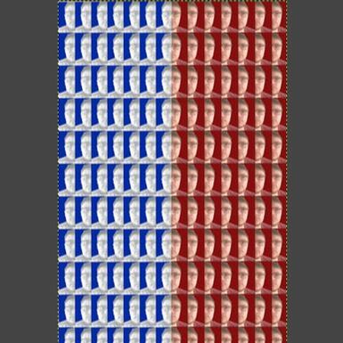
Size: 24in x 36in Medium: Digital Manipulation Completion: April 2019 |
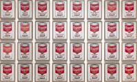
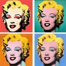
Exhibition Text: Emotion is a piece that is meant to show and go with the theme of being somebody you are not. Emotion was inspired by the works of Andy Warhol and the piece that Andy made of the self portrait of Marilyn Monroe and Campbells Soup Cans. This piece as well as Andy's other portraits inspired me to make this piece. I chose to use Andy's style of repetition and color in my piece to portray the message of not showing or saying how you truly feel. I used the emotions sad and happy and for sad I made the face black and white with the background color of blue and for happy I kept the original color of the face as well as a red background.
Planning
Inspiration
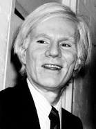
Born on August 6, 1928, in Pittsburgh, Pennsylvania, Andy Warhol was a successful magazine and ad illustrator who became a leading artist of the 1960s Pop art movements. He ventured into a wide variety of art forms, including performance art, filmmaking, video installations and writing, and controversially blurred the lines between fine art and mainstream aesthetics. Warhol died on February 22, 1987, in New York City. When he graduated from college with his Bachelor of Fine Arts degree in 1949, Warhol moved to New York City to pursue a career as a commercial artist. It was also at this time that he dropped the "a" at the end of his last name to become Andy Warhol. He landed a job with Glamour magazine in September, and went on to become one of the most successful commercial artists of the 1950s. He won frequent awards for his uniquely whimsical style, using his own blotted line technique and rubber stamps to create his drawings. British artist Richard Hamilton described pop art as "popular, transient, expendable, low cost, mass-produced, young, witty, sexy, gimmicky, glamorous, big business." As Warhol himself put it, "Once you 'got' pop, you could never see a sign the same way again. And once you thought pop, you could never see America the same way again. Warhol's other famous pop paintings depicted Coca-cola bottles, vacuum cleaners and hamburgers. He also painted celebrity portraits in vivid and garish colors; his most famous subjects include Marilyn Monroe, Elizabeth Taylor, Mick Jagger and Mao Zedong. As these portraits gained fame and notoriety, Warhol began to receive hundreds of commissions for portraits from socialites and celebrities. His portrait "Eight Elvises" eventually resold for $100 million in 2008, making it one of the most valuable paintings in world history. In 1964, Warhol opened his own art studio, a large silver-painted warehouse known simply as "The Factory." The Factory quickly became one of New York City's premier cultural hotspots, a scene of lavish parties attended by the city's wealthiest socialites and celebrities, including musician Lou Reed, who paid tribute to the hustlers and transvestites he'd met at The Factory with his hit song "Walk on the Wild Side" — the verses of which contain descriptions of individuals who were fixtures at the legendary studio/warehouse in the '60s, including Holly Woodlawn, Candy Darling, "Little Joe" Dallesandro, "Sugar Plum Fairy" Joe Campbell and Jackie Curtis. (Warhol was a friend of Reed's and managed Reed's band, the Velvet Underground.)Warhol, who clearly relished his celebrity, became a fixture at infamous New York City nightclubs like Studio 54 and Max's Kansas City. Commenting on celebrity fixation — his own and that of the public at large — Warhol observed, "more than anything people just want stars." He also branched out in new directions, publishing his first book, Andy Warhol's Index, in 1967. I was inspired by his work in pop art and his work in the portraits of famous subjects. That is what inspired me to create a piece with my face multiple times and with different gradation. I also used his style of repetition and the variety of different colors that was used in the portraits and the background.
Inspiration
Born on August 6, 1928, in Pittsburgh, Pennsylvania, Andy Warhol was a successful magazine and ad illustrator who became a leading artist of the 1960s Pop art movements. He ventured into a wide variety of art forms, including performance art, filmmaking, video installations and writing, and controversially blurred the lines between fine art and mainstream aesthetics. Warhol died on February 22, 1987, in New York City. When he graduated from college with his Bachelor of Fine Arts degree in 1949, Warhol moved to New York City to pursue a career as a commercial artist. It was also at this time that he dropped the "a" at the end of his last name to become Andy Warhol. He landed a job with Glamour magazine in September, and went on to become one of the most successful commercial artists of the 1950s. He won frequent awards for his uniquely whimsical style, using his own blotted line technique and rubber stamps to create his drawings. British artist Richard Hamilton described pop art as "popular, transient, expendable, low cost, mass-produced, young, witty, sexy, gimmicky, glamorous, big business." As Warhol himself put it, "Once you 'got' pop, you could never see a sign the same way again. And once you thought pop, you could never see America the same way again. Warhol's other famous pop paintings depicted Coca-cola bottles, vacuum cleaners and hamburgers. He also painted celebrity portraits in vivid and garish colors; his most famous subjects include Marilyn Monroe, Elizabeth Taylor, Mick Jagger and Mao Zedong. As these portraits gained fame and notoriety, Warhol began to receive hundreds of commissions for portraits from socialites and celebrities. His portrait "Eight Elvises" eventually resold for $100 million in 2008, making it one of the most valuable paintings in world history. In 1964, Warhol opened his own art studio, a large silver-painted warehouse known simply as "The Factory." The Factory quickly became one of New York City's premier cultural hotspots, a scene of lavish parties attended by the city's wealthiest socialites and celebrities, including musician Lou Reed, who paid tribute to the hustlers and transvestites he'd met at The Factory with his hit song "Walk on the Wild Side" — the verses of which contain descriptions of individuals who were fixtures at the legendary studio/warehouse in the '60s, including Holly Woodlawn, Candy Darling, "Little Joe" Dallesandro, "Sugar Plum Fairy" Joe Campbell and Jackie Curtis. (Warhol was a friend of Reed's and managed Reed's band, the Velvet Underground.)Warhol, who clearly relished his celebrity, became a fixture at infamous New York City nightclubs like Studio 54 and Max's Kansas City. Commenting on celebrity fixation — his own and that of the public at large — Warhol observed, "more than anything people just want stars." He also branched out in new directions, publishing his first book, Andy Warhol's Index, in 1967. I was inspired by his work in pop art and his work in the portraits of famous subjects. That is what inspired me to create a piece with my face multiple times and with different gradation. I also used his style of repetition and the variety of different colors that was used in the portraits and the background.

|

|
|
|
(n.d.). Retrieved from https://www.google.com/search?tbm=isch&q=Andy Warhol
|
Oceanvalleyblog. (2017, May 04). Modernism- Shot Marilyn. Retrieved from https://oceanvalleyblog.wordpress.com/2017/05/04/modernism-shot-Marilyn/
|
Warhol, A. (n.d.). Andy Warhol. Campbell's Soup Cans. 1962 | MoMA. Retrieved from https://www.moma.org/collection/works/79809
|
Planning Sketches
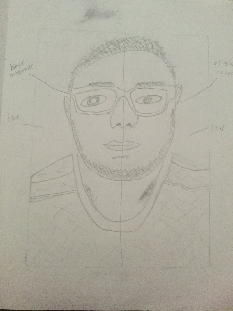
This was a planning sketch of the one face with half being in regular color and half being in black and white. I wasn't really happy with it on paper because it didn't really look like my inspiration. It was an idea though and I later tried it in photoshop to see it seeing it digitally would change my mind.
|
This was a planning sketch of me just in black and white with the idea of having a blue background. I thought that this idea was lacking in in using art technique and skill so I decided not to go through with it but I was closer to what I wanted in a final piece.
|
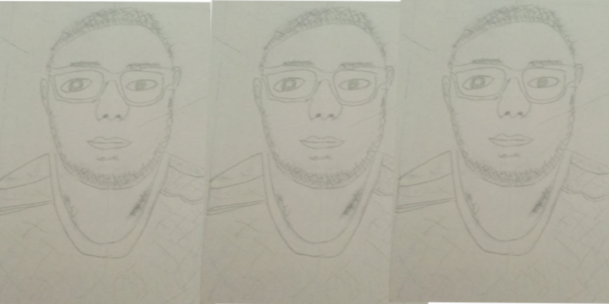
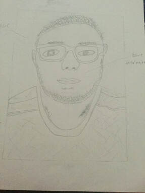
This was a planning sketch of what would eventually be my final piece. I only drew one row but I was happy with how it was a close representation of my inspiration. I was also happy with how it was able to portray the message that I wanted it to.
|
Experimentation
My original intention was to only use one face but have the face split into happy and sad emotions. I had one side with original color and one side with black and white. I was going to do the same thing with the red and blue backgrounds but by this point I wasn't happy with how the piece was looking so I changed it up.
|
Then I just though out having the whole face clack and white with the blue background just having one emotion within my message. I though that it was lacking in technique which made me not go through with this idea.
|
Process
|
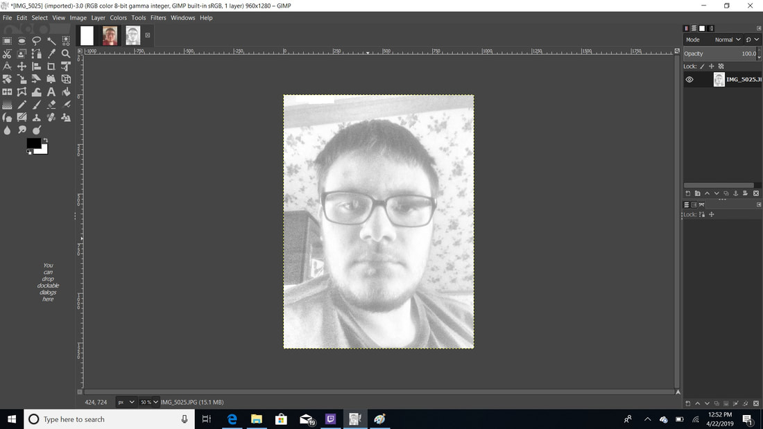
I began the project by taking a picture of my with s smile and without smiling. I did this so I could have the images of be portraying the emotions that I wanted to include in my message. I had to try and keep my head still so when I aligned the sides of the head the would actually line up.
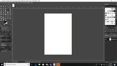
I then used Gimp Photoshop to create my project. I made a new blank white background that was 24in x 36in. This was my main background that I would paste the copied final products onto. |


|
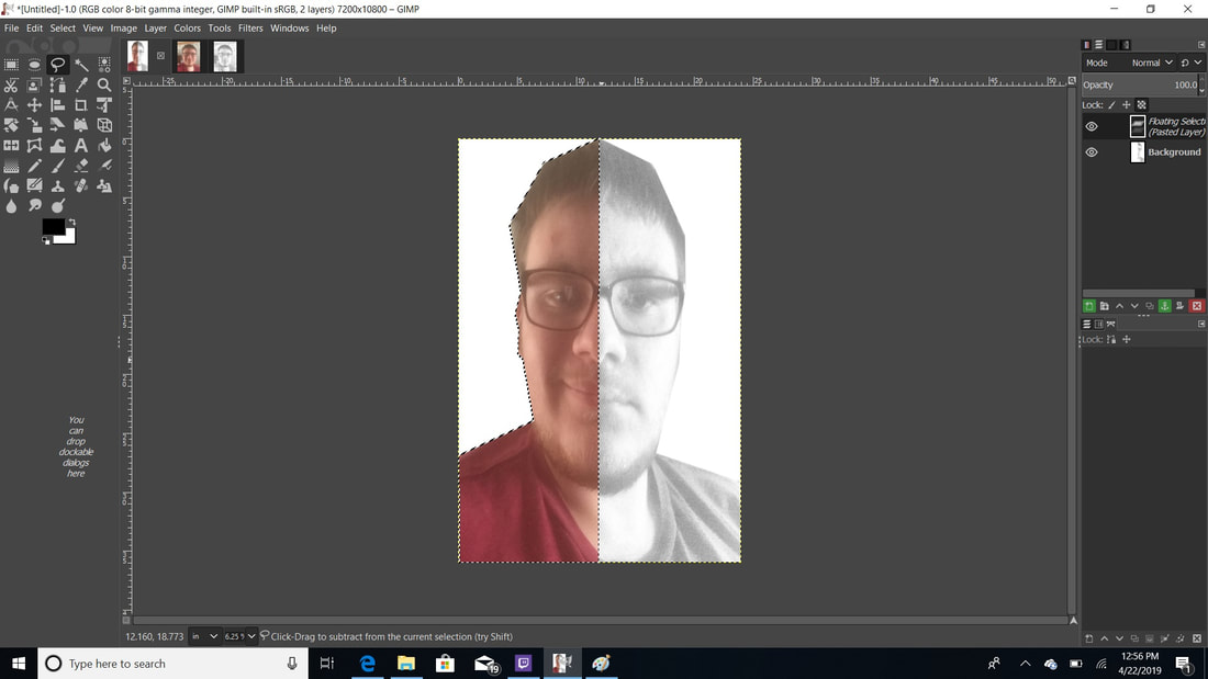
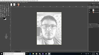
I edited the sadder more normal face and lowered the gradation to make the image black and white. I did this to give the image a better meaning behind it. I wanted the image to give a sad feeling so making it black and white would help me portray that message better. I used the lasso tool to select half of the face and copied it for later.
|
|
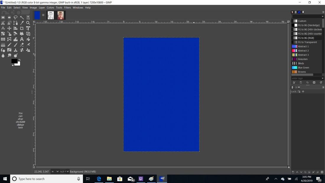
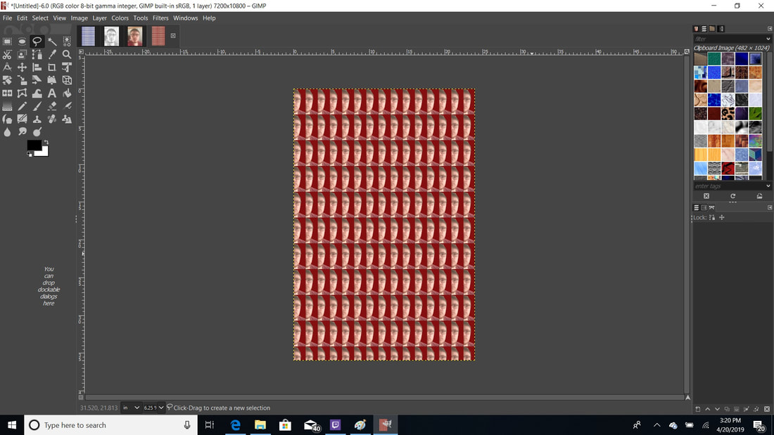
I then made another background that was 24in x 36in and made the background blue. This was to help make the message of sad also more noticeable. Blue is represented with sadness so I made the connection and incorporated it with the black and white face.
|
|
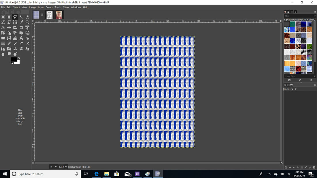
Then while I was on the blue background, I was looking at the patterns that I would maybe use for the background. While doing this, it gave me the option to add the clipboard image and it gave me the product to the left. I was happy with how this looked and it even looked more like my inspiration. The multiple images of my face were just like Warhols portraits and played a role in me keeping the image like this.
|

|
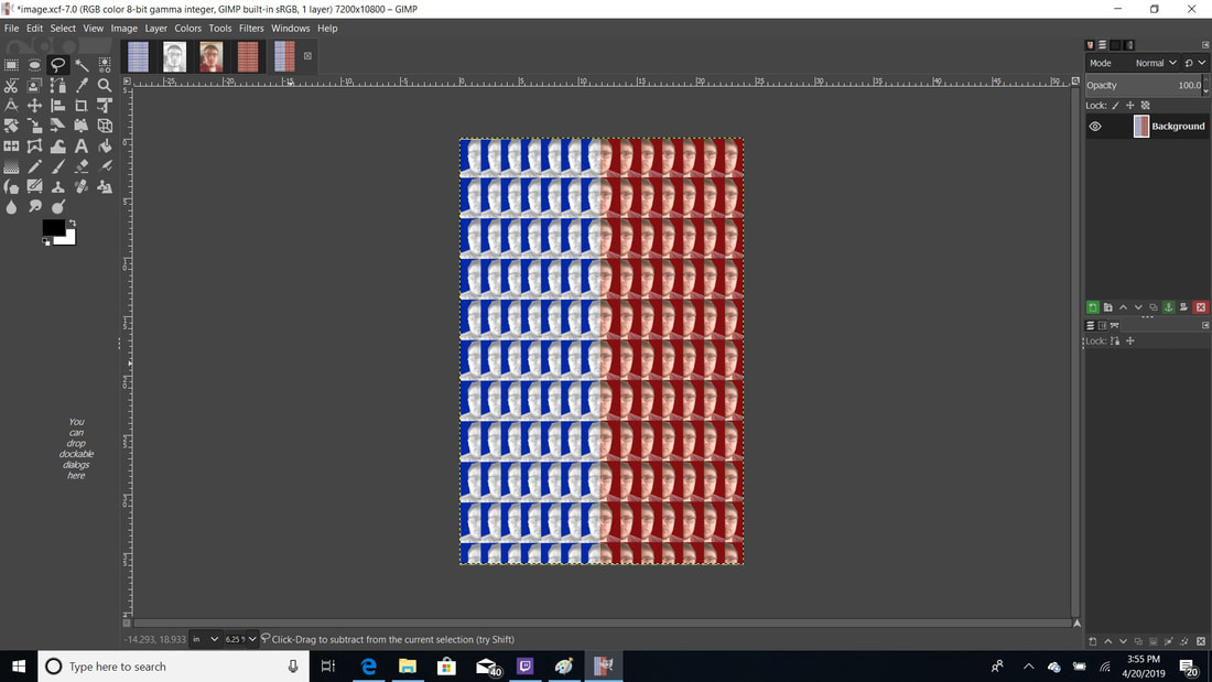
I then made another 24in x 36in background and made this one red. Red is associated with happiness and that is the message that I wanted to portray with this side. This was to make the message of happiness more noticeable.
|
|
I then used the picture of me smiling and used the lasso tool to select the opposite side of my face. I then used the pattern of clipboard image to paste the copied side of my face. I kept the face the normal color to also help portray the message of happiness. This also helped show the difference between the two sides.
|
|
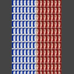
Then I used the lasso tool to select half of each image and copied and pasted it to the original background. I really think that Warhol played a key into the the design of the piece and the multiple images of my portrait. I liked this as the final piece because not only does it look like my inspiration, but I feel like it does a great job of portraying the message that I wanted it to.
|
Reflection
Critique
In the end, I am really happy about how my piece turned out. When the project began, I had a little bit of an idea on what I wanted to include but I didn't know how to show that. Then I was doing my planning sketches and I came up with the idea and that's what I did. I really like the black and white images on top of the blue background because when I look at the piece I get the meaning of sad out of that side. Same thing with the right side and the red background with the normal color face. I get the meaning or happy and sad out of this piece which is what I want. I really felt like the colors had a nice contrast on top of each other and the repitition of the faces gave it the inspiration look. If I could do the project again, I would make less faces because I feel like it is to much and I could have gotten the same message across with less as well.
Compare and Contrast
Similarities
-Repetition in faces
-Portraits of people
-Multiple versions of image
-Solid color background
Differences
-Black and white image of people
-More images of faces
-Digital
|
|

|
ACT Questions
1)Clearly explain how you are able to identify the cause-effect relationships between your inspiration and its effect upon your artwork.
My inspiration played a role in the repetition and color in my piece. I was inspired to do my portrait multiple times in two different ways just like Warhol did. That is what led to my final piece.
2)What is the overall approach the author has regarding the topic of your inspiration?
Andy Warhol was a successful magazine and ad illustrator who became a leading artist of the 1960s Pop art movements. He ventured into a wide variety of art forms, including performance art, filmmaking, video installations and writing, and controversially blurred the lines between fine art and mainstream aesthetics.
3)What kind of generalizations and conclusions have you discovered about people, ideas, cultures, etc. while you researched your inspiration?
This ties into my theme in previous artworks of trying to be someone you aren't. This goes with putting on a poker face to not show people how you may feel which is what a lot of people do.
4)What was the central idea or theme around your inspiration research?
The theme of my piece is not showing someone your true emotions. You may seem like you are happy and everything is all good but in reality you may be upset and something may be wrong.
5)What kind of inferences did you make while reading your research?
If people have this mindset, nobody will really know how you feel. This way nobody can be there to support you or congradulate you when you need it the most.
Bibliography
Andy Warhol. (2019, April 12). Retrieved from https://www.biography.com/artist/andy-warhol
Oceanvalleyblog. (2017, May 04). Modernism- Shot Marilyn. Retrieved from https://oceanvalleyblog.wordpress.com/2017/05/04/modernism-shot-marilyn/
(n.d.). Retrieved from https://www.google.com/search?tbm=isch&q=Andy Warhol
Warhol, A. (n.d.). Andy Warhol. Campbell's Soup Cans. 1962 | MoMA. Retrieved from https://www.moma.org/collection/works/79809
